
Minnesota Department of Human Services Internal SSIS Software
One of the essential services of Minnesota DHS is an Out-of-Home Placement Plan (OHPP). This plan is designed to place a child who is in an unsafe environment into a location outside of their home. An individualized OHPP document is printed and given to each person involved in the case. My team and I were given the opportunity to evaluate the usability of the software and were able to give recommendations for incremental improvements that could have a positive impact on the caseworkers that use the software regularly like combining redundant requests for information.
My Role
UX Researcher
UX/UI Designer
Tools
Figma
Keynote
Notion
Methods
Cognitive Walkthrough
Contextual Inquiry
Interactive Prototype
Defining the Problem Space
Trimming loose ends
To get an idea of what issues might exist, we first employed a cognitive walkthrough which was a standardized evaluation of each task and associated steps involved and asked a set of four questions to determine what problems might exist. The criteria for each step was:
Will the user try to achieve the right outcome?
Is the correct action visible?
Is there a clear connection between the control and the resulting action?
Is there sufficient and/or appropriate feedback?
I looked at three specific tasks in the OHPP creation process and found that users’ mental model didn’t always match up to how the system actually worked. If an input field is not filled in, the question would not print. This is by design. Only the information that is relevant to the specific case needs to be shown and printed on the final document. However, there is no indication of this function in the form, and as a result, some caseworkers would type in the field N/A if the question wasn’t relevant. This would make the unnecessary question and response print out in the final document.
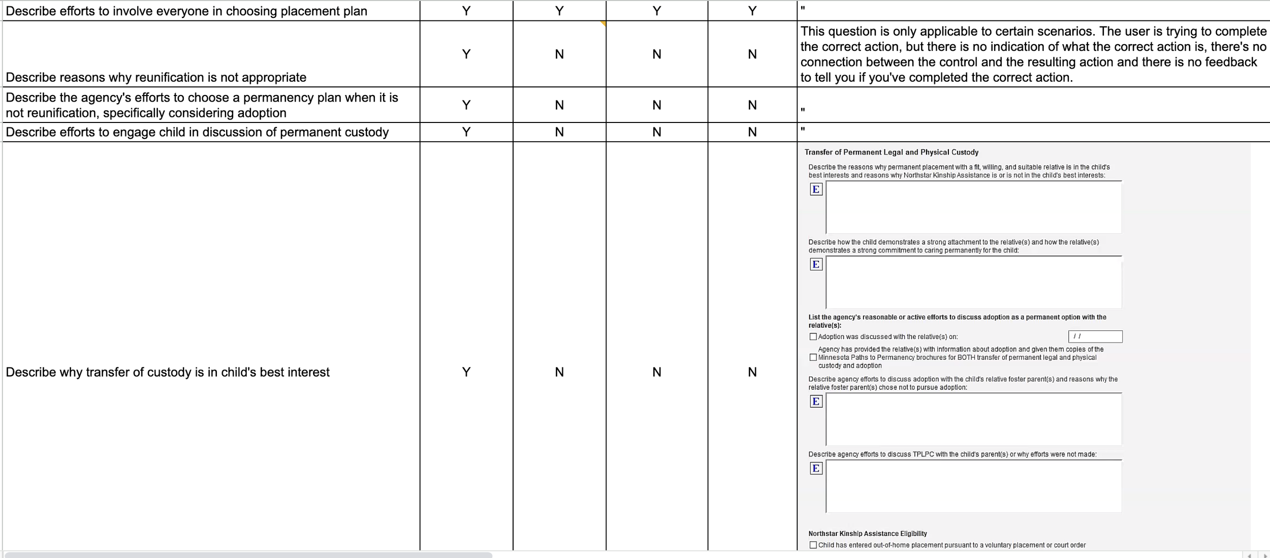
Screenshot of Cognitive Walkthrough
Understanding the Users
Information Overload
After getting an initial impression of the problems that might exist in the SSIS application, we wanted to understand how the caseworkers actually use the program, what their environment and other tools are, and what their most urgent needs are. We conducted two contextual inquiry sessions with active caseworkers where our goal was to find out as much as possible about these areas.
One thing became very evident, the OHPP documents took too long to fill out and more importantly, had so much information that the final document was too overwhelming for parents to be able to comprehend. One caseworker gave us valuable insight into what it was like to walk parents through these documents.
“ We just lose our clients...you can’t get through 16 pages of a document, and they do not understand what you just said to them. It’s not real life for the people that we work with. And it’s not fair to them. They just leave confused.”
During these sessions, the participants also pointed out many pages that were asking for redundant information. Some questions had so much overlap that they were practically the same question. There were also lists of check boxes that would ask a yes or no question and then ask the same question the other way around. For example, a check box that said “Child has known allergies” and then another that said “Child has no known allergies”. This could easily be condensed into one question and these types of redundancies were present throughout the application. They not only made the OHPP document needlessly lengthy, but also increased the amount of time and energy caseworkers had to put into the process.
Ideation & Final Solution
A Framework for Change
Now that I had a clear understanding of where the problems lay and what the users’ needs were, I wanted to create a set of recommendations that could be used as examples to be applied throughout the SSIS application. This was not an easy task. The issues were fairly small in each instance, but pervasive in the software. It felt like to fix anything, I had to fix everything. I also only had about three full days after the contextual inquiry sessions to come up with this set of recommendations. I could’ve easily spent a month with the caseworkers, watching their process, finding out which language was legally required, trying to make thorough recommendations and testing to see how these changes might affect the usability of the software. With this minuscule time frame, I had to pinpoint what examples could communicate the most impactful change possible.
There were three issues I wanted to address:


For visibility and language, I revised the Permanency Plan page. I used this page to show how instructional language would lead to a match between the user’s mental model and the system model. This only needed a small change to help the user understand the correct use of the application. It shows that all optional questions are placed in the same area below a heading that describes the questions as not being required and to leave blank if not applicable. This will prevent the unnecessary questions from printing out. The first question is required and thus must be completed (in this case by being clicked) before clicking Next to move to the next page. If it is not filled out, there will be a warning that appears under the missing info.
Next, is the Child Placement Preferences page. In the current system, there are six check boxes followed by 3 text input fields. Most of the information requested by the check boxes would be covered in the input fields and therefore could be removed. The input fields are also only applicable based on the answers to two of the check box questions.

I condensed this into a single yes or no question that asks if the child is of sufficient age to express preferences. If the answer is No, that’s all that’s necessary and you can move to the next page. If Yes, it asks you what has been done to get the child’s input on their preferences and also to consider these preferences for placement. It also asks if the child is currently placed in their identified preference. If Yes, you can move on. If No, it will ask to give details to why. This flow reduces the amount of information the user needs to sift through in order to complete the page accurately. They only need to take in one or two elements of information at a time.
Lastly, the Services Provided to the Parent or Custodian page is a good example of the given workflow not matching up to the type of information the caseworkers need to enter. Originally, this page was a giant table of available services with empty boxes for the specific service provider name, the status and any additional comments. We found that these topics were often nuanced and required a considerable amount of description that made these small text boxes an inappropriate input method. In the revised version, the page has a single drop down from which you can add any applicable service to the list below and then fill out the information about that service. The required fields for each service only appear once you’ve added the desired service, again reducing the amount of info the user needs to take in to move through the page.

What I Learned
Government services are complicated, multi-layered systems and I realized very quickly that I did not have anywhere near a complete or accurate understanding of how these agencies and programs worked and interacted with each other. If I were to work with the state of Minnesota again, I would want to spend way more time finding out the process these caseworkers go through every day, preferably watching them do their work while they’re doing it. Something I only touched on at a very small level was the amount of redundancy in these forms. If I was the one to recommend changes to the entire system, I would need to work through every single page, write down all the information that was requested, and then make the types of changes I listed above to the entire document instead of just focusing on three pages. This would surely require many meetings to discuss what changes could legally be made and what language and terms could be changed to more plainly indicate their meaning.
Complete Interactive Tour