
CURE Design Strategy
CURE is a non-profit that communicates with and mobilizes greater Minnesota communities to take practical action on issues that affect the environments and places they care about. Climate issues are complex and varied in nature and CURE was wanting to get better at planning effective communication with their constituents and garnering a larger base of committed individuals. I was on a team of four that created a design strategy for CURE.
My Role
UX Researcher - UX/UI Designer
Tools
Figma, Notion
Methods
Comparative Analysis, User Journey mapping, Rapid Prototyping, Tech Scoping, Kano Analysis
Spreading Their Wings
Defining the Problem
CURE originally started as a singularly focused organization, the letters of its name standing for Clean Up the River Environment. After this era of water quality advocacy, they have branched out to address a broader set of topics that impact the Minnesota area. They have a core audience carried over from their earlier years but want to grow their constituent base even further, especially attracting young people to their cause. Because of the breadth and often intangible nature of their work, finding effective and realistic entry points to being engaged with the organization can be difficult.
Where Are the Users?
Identifying Touch Points
Because we wanted to focus on attracting more young people to bolster the health of CURE, we wanted to know how this demographic was already interacting with climate topics. Where were they getting their information, spending their time, and responding to these touch points? I found that “56% of 14- to 18-year-olds said that they learn ‘some’ or a ‘lot’ about climate change from social media such as YouTube and TikTok.” I also found that YouTube was the most common place climate change information was viewed, with Facebook, TikTok, and Instagram following closely behind. We chose to limit our design strategy to YouTube, Instagram, and the CURE website so that their efforts could be more targeted and effective.
“I feel like social media is the best way to spread information about this topic to our generation…I can’t think of anyone who watches the news like our parents.”
…I Have a Plan
Guiding Statement & Touchpoint Map
After studying the ways that CURE interacts with its constituents and facilitates action, we worked together to list out all the current and possible touch points that CURE utilizes in their work. We then decided on the touch points that were most relevant to our strategy and Maggie Langford synthesized this into a touch point strategy map.
Click here to open the Touchpoint Strategy Map PDF
User Journey
There were four main areas or phases of the typical user journey: discovery of the organization, taking an action, retention, and recruitment. CURE would need to have enough visibility that users would know they exist, have a frictionless task flow so that taking actions was easy and understandable, celebrate their wins and show the impact of their constituents’ involvement so that they are encouraged to return and also share their experiences with others, restarting this onboarding cycle.


Discovery
Action
Retention
Recruitment


Actionable Examples
Partnering with Local Influencers
I created a screen flow that illustrated examples of how this user journey could be accomplished.
The first screen showed a method of gaining visibility by partnering with Minnesota-based YouTubers who make videos that are watched by thousands of people and how harnessing that built-in audience can be a huge benefit. This is an example of a video that focuses on the topics that CURE is concerned with but even just a small segment that highlights what CURE is doing with a link to how to get involved can be effective.
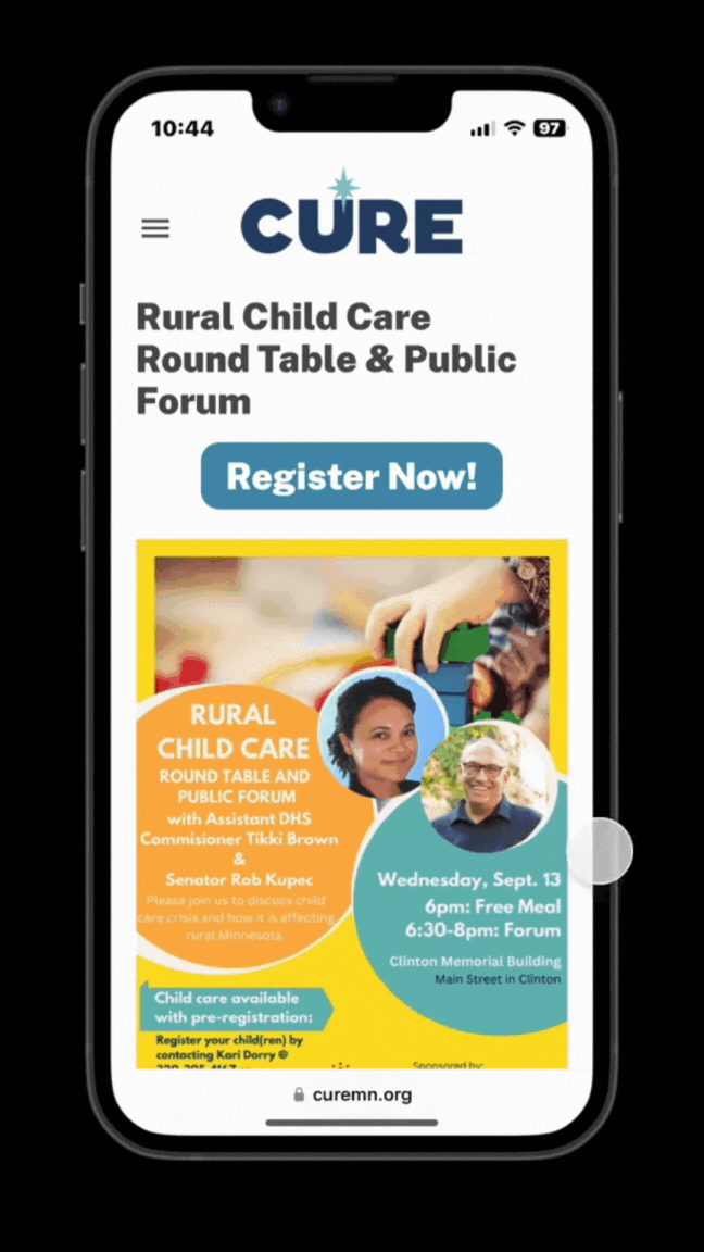
A Mobile-Optimized Sign up Screen Flow
The next screen shows a mobile-optimized version of an event advertised by CURE. The header elements have been condensed to allow the most important things to be seen right away without having to scroll. This reduces the amount friction present in the process, making it less likely that people will give up before finishing. Register Now CTA’s are at the top and the bottom of the page to be available at both likely points of action.

Spreading the Word on Instagram
Lastly, they can share the event on Instagram, letting people know what’s going on and encouraging others to get involved as well.

Final Video Presentation Deliverable
Next Steps & Learnings
Website Revamp
I would’ve liked to spend more time redesigning the website’s information architecture. We didn’t have time to address it in a thorough way, but it could’ve benefitted from a simplification of sections and elements. There were 5 main navigation elements with many selections within them that even had sub-selections within those. Keeping this information present while streamlining how the different sections were presented would’ve made the CTA’s more clear. It was difficult to tell which pages were purely educational as opposed to being designed to ask the user to perform an action.